
Who We Help
Case Studies
About Us
Insights
About
Pricing
Feature [CMS]
Feature Details [CMS]
Integration
Team
Blog [CMS]
Blog Details [CMS]
Contact v1
Contact v2
FAQ
Privacy
Terms
404

Who We Help
Case Studies
About Us
Insights
About
Pricing
Feature [CMS]
Feature Details [CMS]
Integration
Team
Blog [CMS]
Blog Details [CMS]
Contact v1
Contact v2
FAQ
Privacy
Terms
404
Healthcare Revenue Cycle Assessment: Sample Report
Healthcare Revenue Cycle Assessment: Sample Report
Healthcare Revenue Cycle Assessment: Sample Report


In this post, we'll take you through a condensed version of a healthcare revenue cycle assessment report. The insights shared here give a taste of the kind of data analysis and actionable recommendations that we provide in our full reports. If you’d prefer to watch a video instead, you can find it below. Otherwise, let’s dive in!
Missed Revenue Opportunity
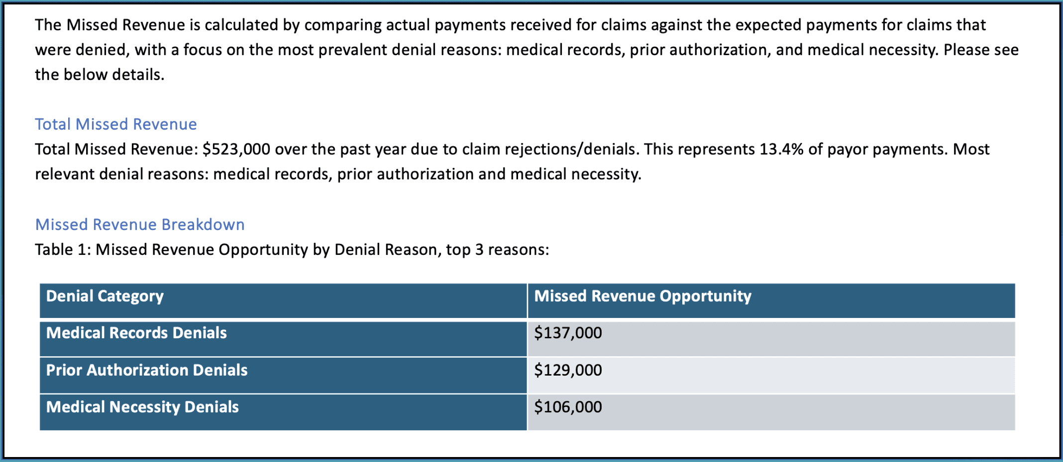
The first area we focus on is identifying missed revenue due to claim denials. In this example, $523,000 in revenue was lost over the past year, which represents about 13.4% of payor payments. Denials related to medical records, prior authorization, and medical necessity were the biggest culprits.
This section of the report highlights where healthcare providers can recover the most revenue by addressing these common issues.
Quarterly Financial Metrics
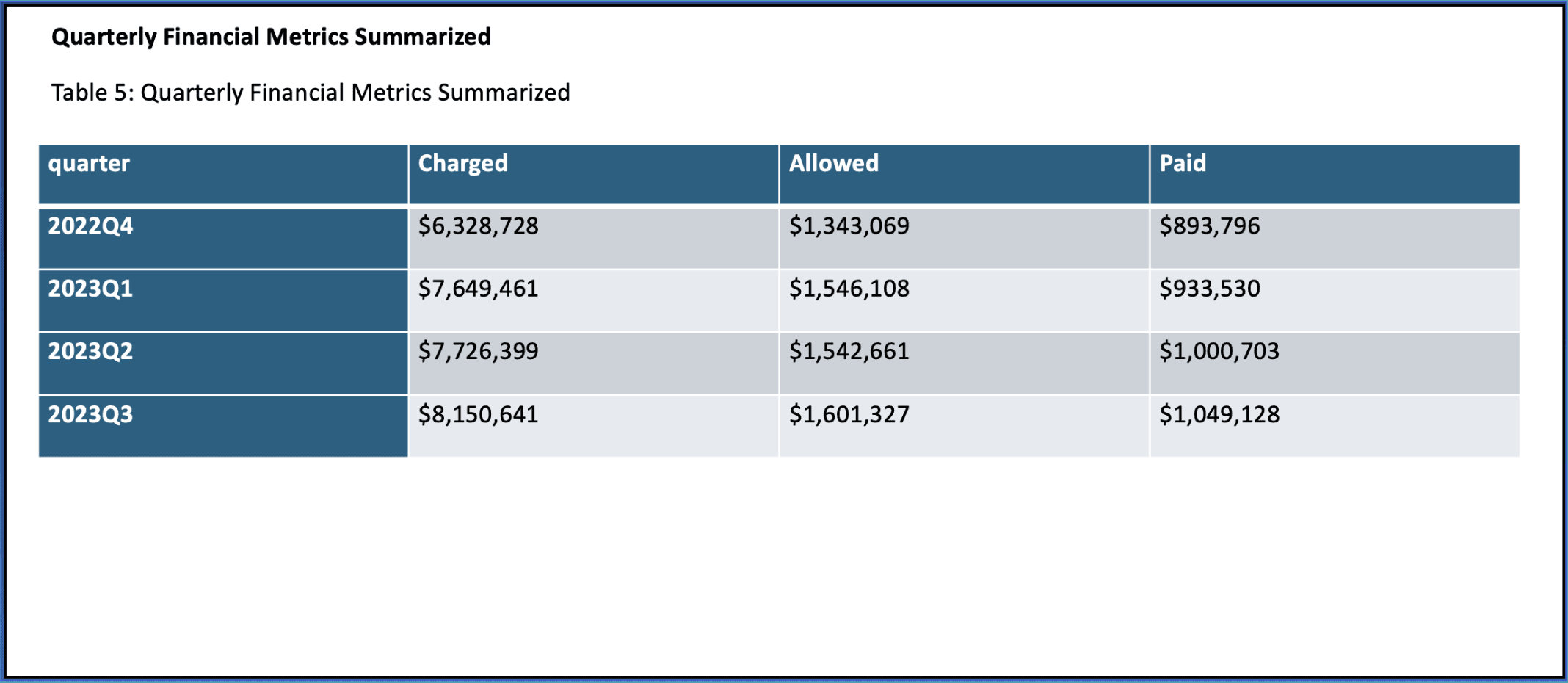
Next, we zoom out to look at financial performance on a quarterly basis. This is a key part of our analysis as it provides a broader view of trends over time—like whether there are consistent gaps between what’s charged and what’s paid.
In this example, we review data from Q3 2022 to Q3 2023. These metrics help identify long-term trends and patterns that can guide strategic decisions.
Monthly Financial Metrics
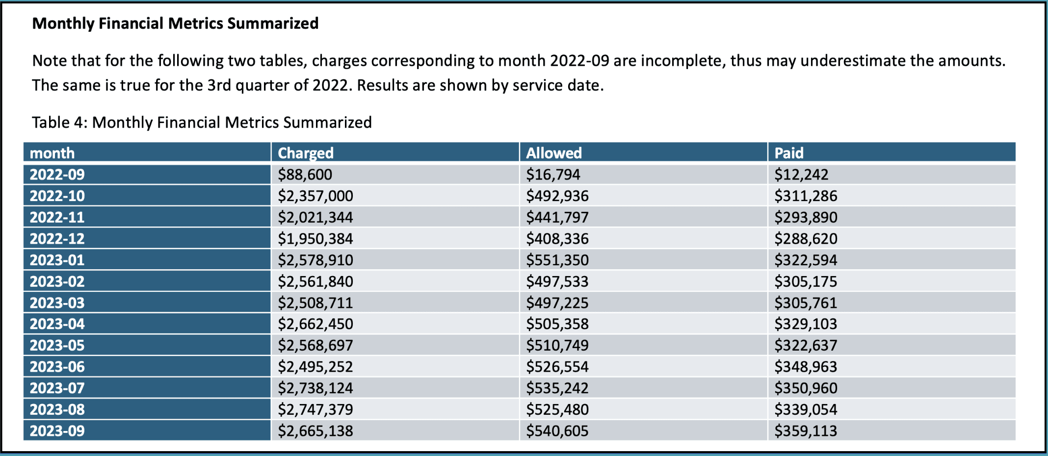
After looking at the quarterly data, we drill down into the monthly financial metrics to capture short-term fluctuations. By reviewing charges, allowed amounts, and payments on a month-by-month basis, we can spot immediate issues that might require attention.
This section is crucial for identifying anomalies that could otherwise go unnoticed in a quarterly view.
Top 10 CPT Code Analysis
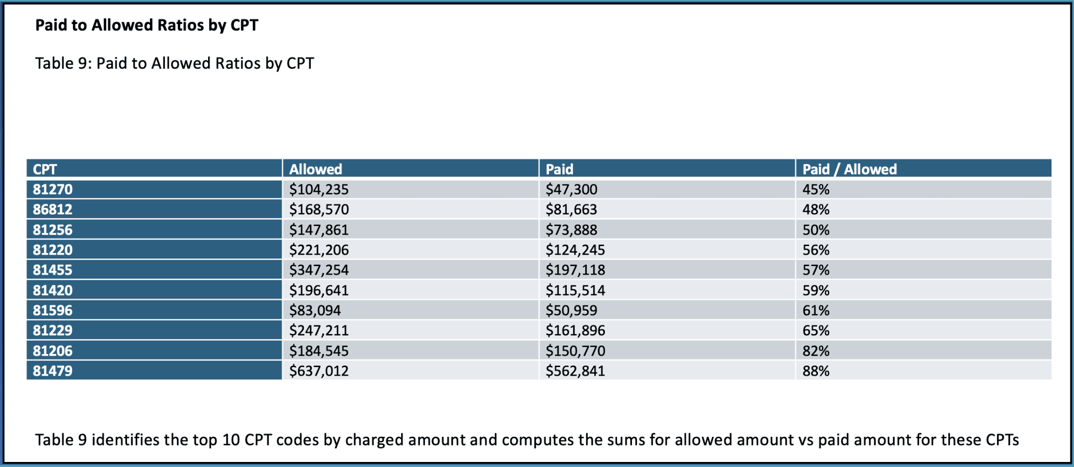
Our analysis then moves into the top 10 CPT codes by charged amount. Here, we compare allowed and paid amounts for each code to highlight where the biggest gaps are.
This type of breakdown is useful for identifying specific procedures that might require more attention in terms of claim management or payer negotiations.
Provider Risk Scores
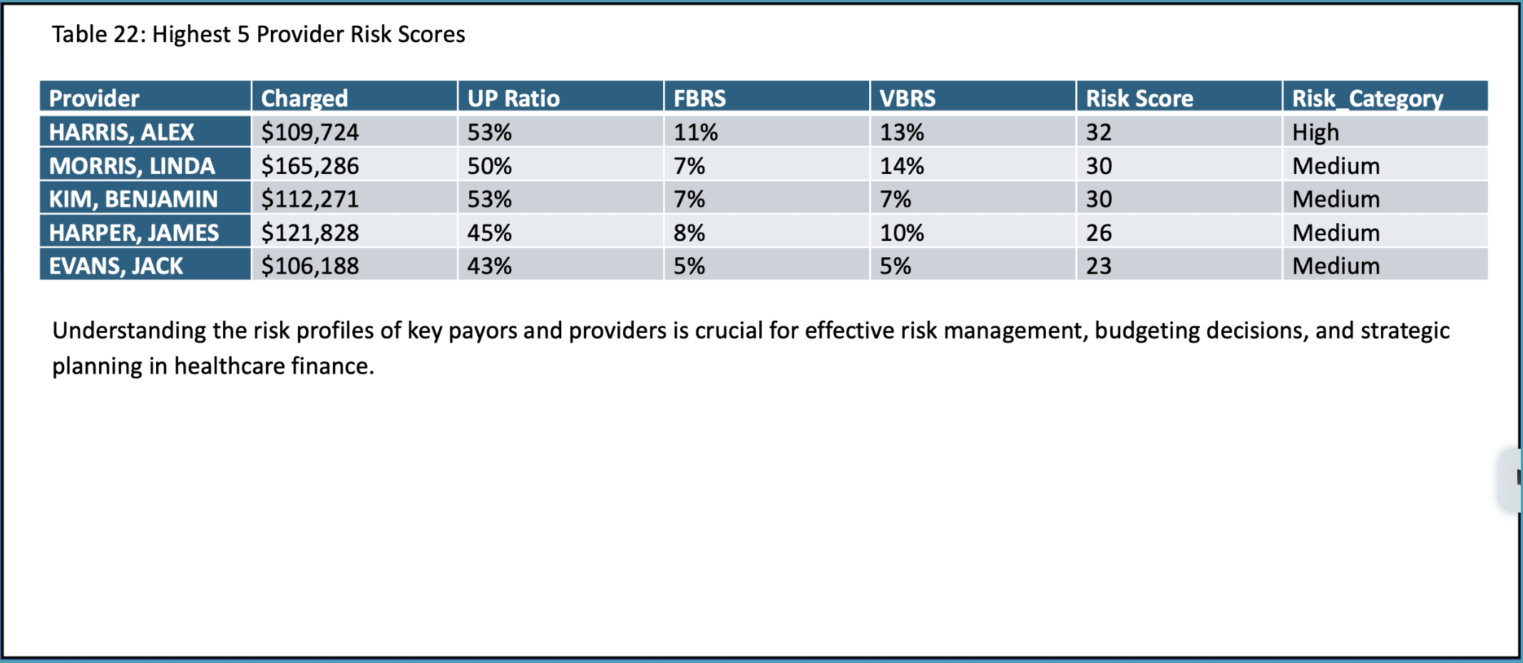
To understand where financial risks lie, we evaluate the risk scores for individual providers. These scores are based on metrics like underpayment ratios, fraction-based rejection scores, and volume-based rejection scores.
By identifying high-risk providers, organizations can focus on improving documentation, coding practices, and billing efficiency to reduce financial exposure.
Paid to Allowed Ratios by Provider
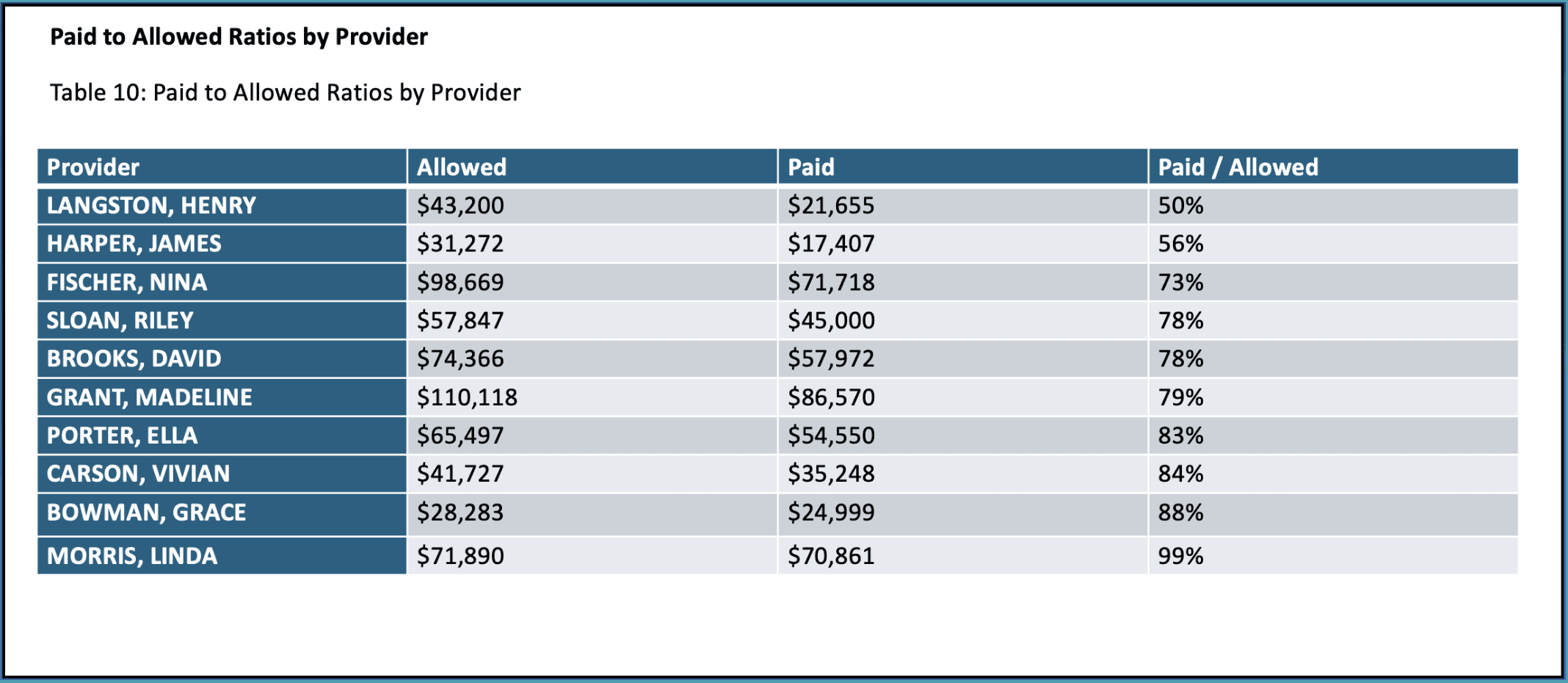
Next, we look at paid-to-allowed ratios by provider. This ratio tells us how much of the allowed amount is actually collected from each provider, which can uncover issues related to underpayments or claim denials.
Providers with lower ratios might need closer attention to improve collections and payment efficiency.
Payer Performance Metrics
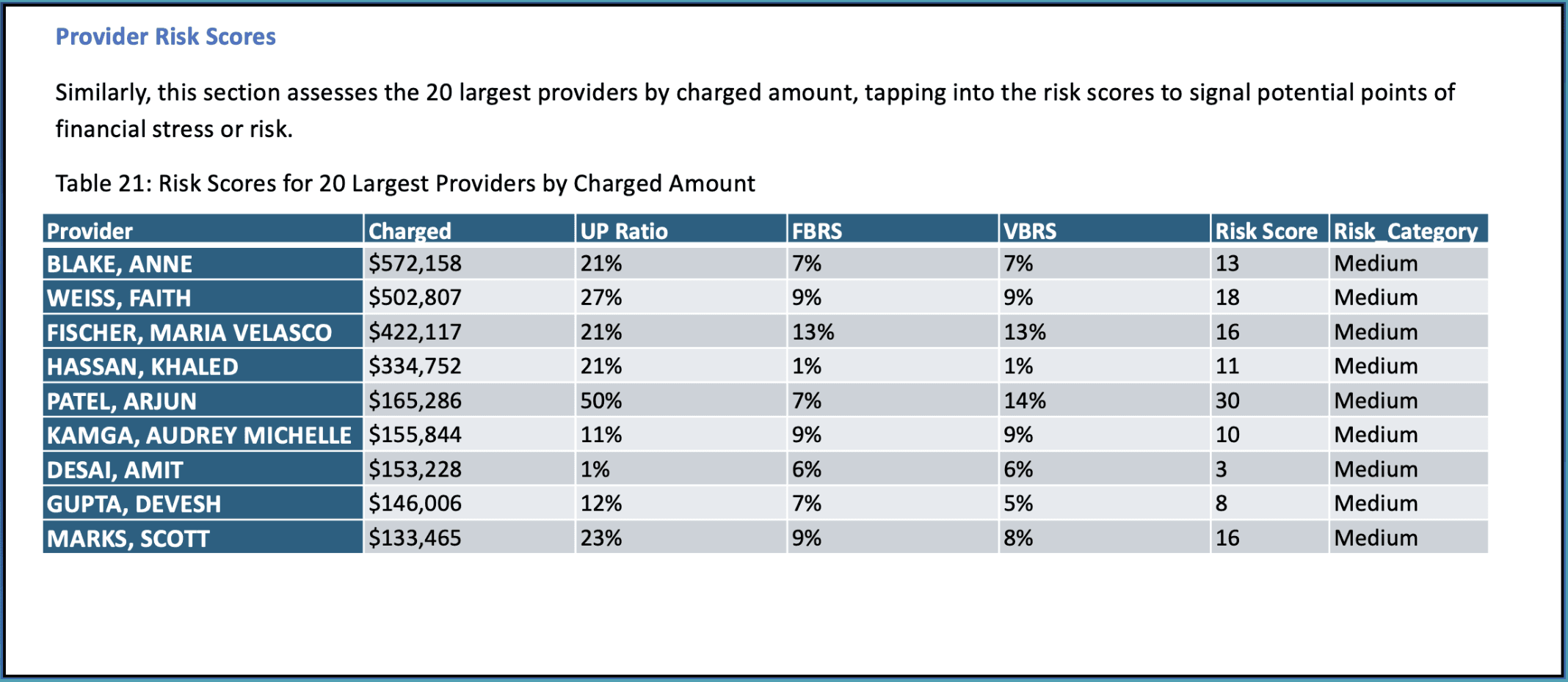
This section evaluates how well different payers are performing in terms of charges, allowed amounts, and payments. This analysis helps you see which payers are underperforming and where contracts might need renegotiation or claims require closer follow-up.
Paid to Allowed Ratios by Payor
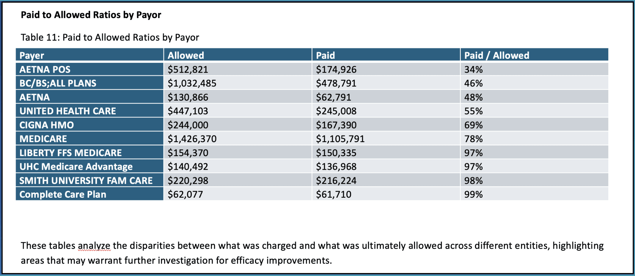
Continuing with payer performance, we now focus on the paid-to-allowed ratios for each payer. This ratio reveals how efficiently each payer converts allowed amounts into actual payments.
For example, some payers may only be paying a fraction of what’s allowed, signaling the need for more aggressive follow-ups or negotiations.
Targeted Improvement Areas
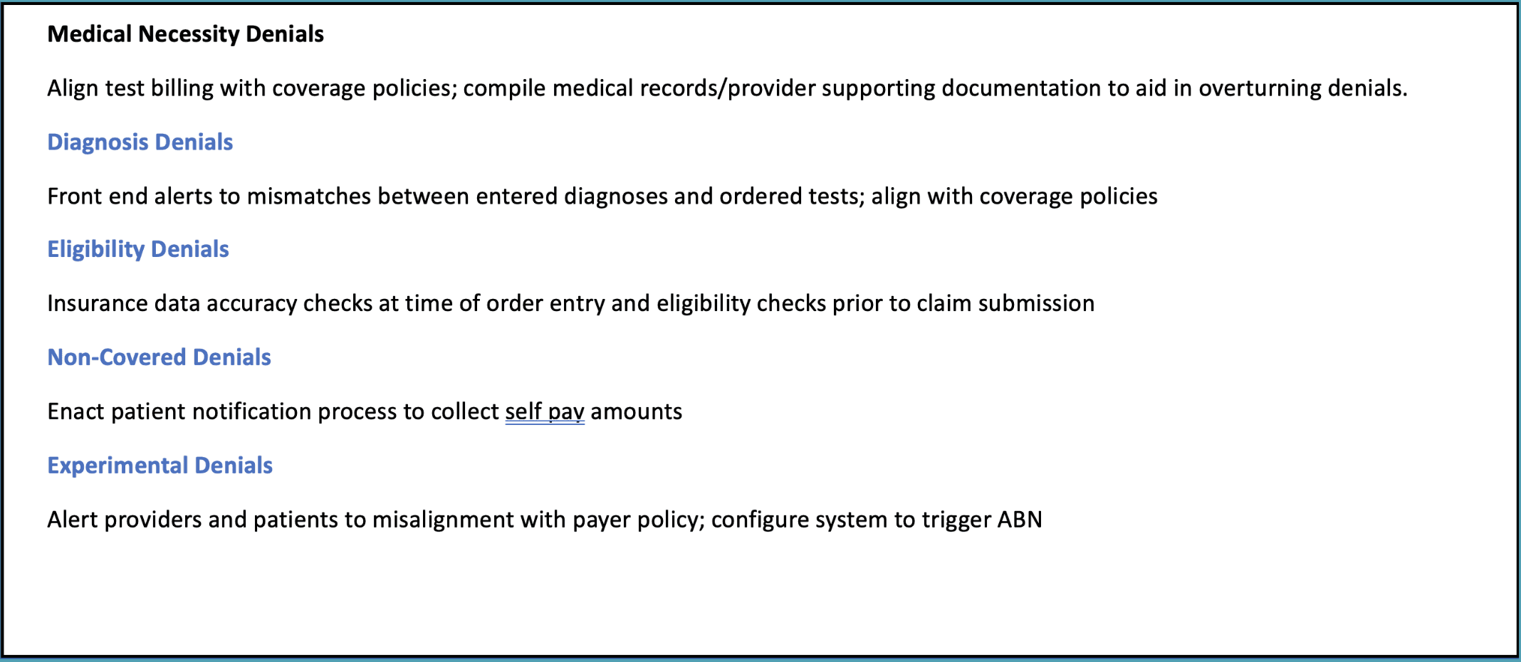
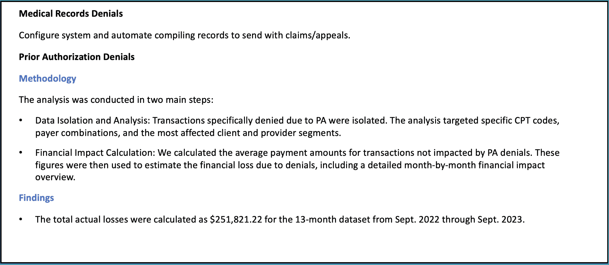
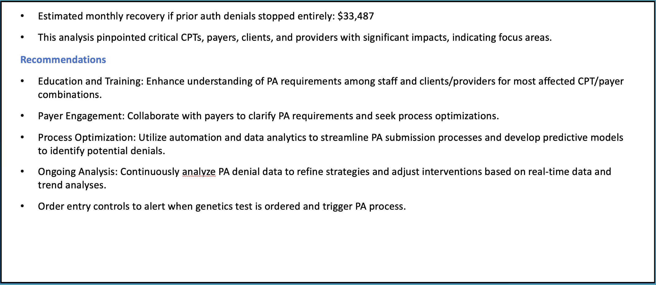
Finally, we explore targeted improvement areas. This part of the report identifies common denial types—such as medical necessity, prior authorization, and medical records—and suggests actionable ways to reduce denials and recover more revenue.
For instance, automating the submission of medical records with claims or streamlining the prior authorization process can help improve outcomes. Addressing these issues can lead to significant revenue recovery, as seen in the example where stopping prior authorization denials would have recovered $33,000 a month.
Next Steps
Thank you for reading this post about our sample RCM assessment output.
If you’re looking for help, our Complimentary Assessment is the first step to identifying potential gaps in your revenue cycle. This assessment quantifies any missing revenue and measures the gap between your current performance and potential earnings. It provides a clear picture of where revenue may be leaking, all with no obligation.
This free service gives you valuable insights without any cost and helps us determine if a more in-depth diagnostic is necessary.
Even if no significant opportunities for improvement are found, you still gain clarity at no expense.
Healthcare Revenue Cycle Assessment: Sample Report
Healthcare Revenue Cycle Assessment: Sample Report


In this post, we'll take you through a condensed version of a healthcare revenue cycle assessment report. The insights shared here give a taste of the kind of data analysis and actionable recommendations that we provide in our full reports. If you’d prefer to watch a video instead, you can find it below. Otherwise, let’s dive in!
Missed Revenue Opportunity

The first area we focus on is identifying missed revenue due to claim denials. In this example, $523,000 in revenue was lost over the past year, which represents about 13.4% of payor payments. Denials related to medical records, prior authorization, and medical necessity were the biggest culprits.
This section of the report highlights where healthcare providers can recover the most revenue by addressing these common issues.
Quarterly Financial Metrics

Next, we zoom out to look at financial performance on a quarterly basis. This is a key part of our analysis as it provides a broader view of trends over time—like whether there are consistent gaps between what’s charged and what’s paid.
In this example, we review data from Q3 2022 to Q3 2023. These metrics help identify long-term trends and patterns that can guide strategic decisions.
Monthly Financial Metrics

After looking at the quarterly data, we drill down into the monthly financial metrics to capture short-term fluctuations. By reviewing charges, allowed amounts, and payments on a month-by-month basis, we can spot immediate issues that might require attention.
This section is crucial for identifying anomalies that could otherwise go unnoticed in a quarterly view.
Top 10 CPT Code Analysis

Our analysis then moves into the top 10 CPT codes by charged amount. Here, we compare allowed and paid amounts for each code to highlight where the biggest gaps are.
This type of breakdown is useful for identifying specific procedures that might require more attention in terms of claim management or payer negotiations.
Provider Risk Scores

To understand where financial risks lie, we evaluate the risk scores for individual providers. These scores are based on metrics like underpayment ratios, fraction-based rejection scores, and volume-based rejection scores.
By identifying high-risk providers, organizations can focus on improving documentation, coding practices, and billing efficiency to reduce financial exposure.
Paid to Allowed Ratios by Provider

Next, we look at paid-to-allowed ratios by provider. This ratio tells us how much of the allowed amount is actually collected from each provider, which can uncover issues related to underpayments or claim denials.
Providers with lower ratios might need closer attention to improve collections and payment efficiency.
Payer Performance Metrics

This section evaluates how well different payers are performing in terms of charges, allowed amounts, and payments. This analysis helps you see which payers are underperforming and where contracts might need renegotiation or claims require closer follow-up.
Paid to Allowed Ratios by Payor

Continuing with payer performance, we now focus on the paid-to-allowed ratios for each payer. This ratio reveals how efficiently each payer converts allowed amounts into actual payments.
For example, some payers may only be paying a fraction of what’s allowed, signaling the need for more aggressive follow-ups or negotiations.
Targeted Improvement Areas


Finally, we explore targeted improvement areas. This part of the report identifies common denial types—such as medical necessity, prior authorization, and medical records—and suggests actionable ways to reduce denials and recover more revenue.
For instance, automating the submission of medical records with claims or streamlining the prior authorization process can help improve outcomes. Addressing these issues can lead to significant revenue recovery, as seen in the example where stopping prior authorization denials would have recovered $33,000 a month.
Next Steps
Thank you for reading this post about our sample RCM assessment output.
If you’re looking for help, our Complimentary Assessment is the first step to identifying potential gaps in your revenue cycle. This assessment quantifies any missing revenue and measures the gap between your current performance and potential earnings. It provides a clear picture of where revenue may be leaking, all with no obligation.
This free service gives you valuable insights without any cost and helps us determine if a more in-depth diagnostic is necessary.
Even if no significant opportunities for improvement are found, you still gain clarity at no expense.
